
How To Use PowerPoint Map Templates In Your Presentations
Maps can play an important role when talking about geography, office locations, or the potential to expand. They are great tools for telling visual stories – showcasing your business locations around the globe, supply chains, the target market for your product, etc.

Usually, people use images in their presentations to present maps which can be dull and confusing. A better alternative is to use PowerPoint map templates.
Benefits of Using PowerPoint Map Templates
There are many benefits of using PowerPoint map templates in your business presentations. Map templates for PowerPoint can depict a company’s presence in the global market, its products, its market shares, demographics, etc.
It can also be used to showcase your raw materials suppliers and plot their routes, market demands, and other elements that can benefit a business.
Using PowerPoint maps can increase your presentation's quality and make it more attention-grabbing. But designing maps from scratch is not only difficult but also time-consuming.
This is where pre-designed PowerPoint map templates come in. Engaging PowerPoint templates have various benefits when using them in presentations.
These templates help you save time and are a boon for users with zero design skills.
You can find pre-designed maps online for any country, region, or even city worldwide. Many resources are available on the web that provides 100% editable and customizable templates which are compatible with PowerPoint and Google Slides.
We will look at a few examples of US map templates and see how you can use them in your presentations.
1. Locations
This US PowerPoint Map, for example, can be used to showcase the specific locations of your business, such as the plant, your headquarter, warehouse, etc., in the US.
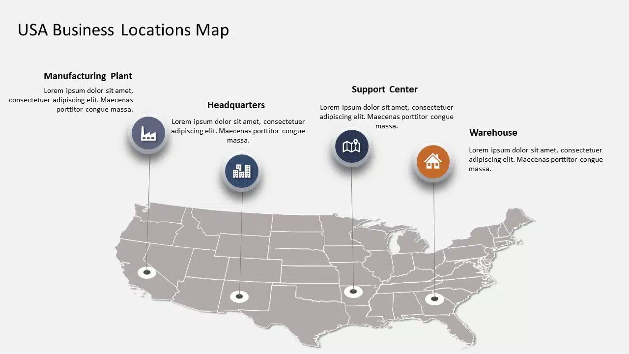
This template is useful for a company that has set up its businesses at different locations. You can edit the colors and sizes of the map and the icons. This visually appealing map template can show all your operating locations at a glance.
2. Market Share
This particular US Map Template is designed for marketers to showcase their product or service's market share in different US states.

The map is easily understandable, using color coding to represent the percentage of markets acquired in different states. The bars are also customizable; you can increase or decrease the bars' length per your presentation needs.
3. Market Share of Products & Demographics
This particular editable US PowerPoint Map does two things, it showcases not only the market share of your products or services but also showcases the demographics of your customers. Each color here represents a different product.
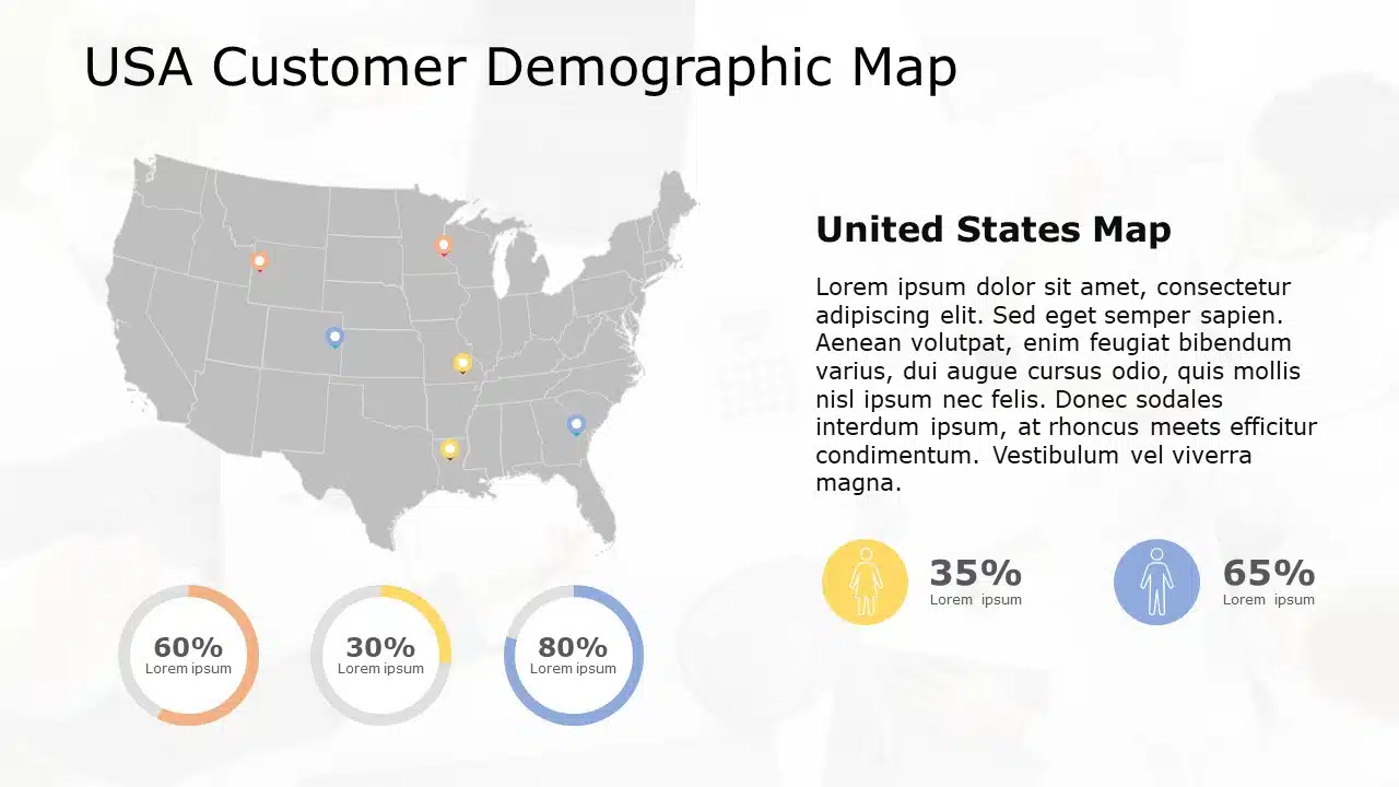
For example, yellow shows that the specific product has a 30% market share in the two different states. Effectively using colors, numbers, and icons makes this template understandable and engaging. This template can be used in your marketing presentations highlighting strategic areas for a company.
4. History Timeline
You can use this US Map PPT to showcase the history timeline of your business. You can use different colors to show the key highlights in the first year, second year, etc.

You can write the years on the timeline along with a brief description. This US Map for PowerPoint is fully editable, you can change the colors and size of the map according to your brand. This is a visually engaging way to showcase the company’s evolution or history timeline.
5. Key Highlights
You can use this US Map PowerPoint template to showcase the key highlights of various states, such as desired raw material found in region A, state D being the best fit for setting up our plant, etc.

How To Create Maps in PowerPoint?
Creating a map in PowerPoint is a bit difficult and time taking process. But we have tried to put together a step-to-step process for creating a simple map.
Here is how you can quickly add a map to your slides:
1. Click on Insert > Chart.
2. A window will pop up. Select Map for the sidebar and click OK.
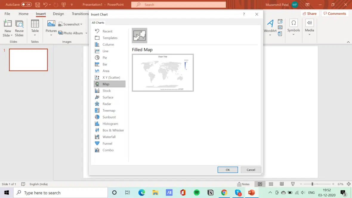
3. PowerPoint creates a world map and opens an Excel sheet where you can write country names and values. The map will automatically change as soon as you change the values.

4. When you are finished, click on the X of the Excel sheet to close it.
5. To edit, right-click on the map, choose “Edit Data,” or click on the map and choose Chart Design > Edit Data in the menu.

You can then edit the colors and size of the map according to your brand and presentation needs.
Conclusion:
PowerPoint Maps can take your business presentation’s quality to a new level, making it easy to showcase your locations, market share, history, etc. They make your presentation more understandable and visually compelling.
Posting Komentar untuk "How To Use PowerPoint Map Templates In Your Presentations"